Overview
The OTT market has experienced steady growth over the past few years, and the next five years are expected to see further increases in both scale and expansion. In this rapidly evolving landscape, various OTT companies are seeking innovative strategies to remain competitive. Gather aims to combine integrated OTT services with an open hybrid TV, creating a platform where users can communicate and access optional services beyond just content delivery.

Background
The OTT market has experienced steady growth over the past few years, and the next five years are expected to see further increases in both scale and expansion. In this rapidly evolving landscape, various OTT companies are seeking innovative strategies to remain competitive. Gather aims to combine integrated OTT services with an open hybrid TV, creating a platform where users can communicate and access optional services beyond just content delivery.

Overview
The OTT market has experienced steady growth over the past few years, and the next five years are expected to see further increases in both scale and expansion. In this rapidly evolving landscape, various OTT companies are seeking innovative strategies to remain competitive. Gather aims to combine integrated OTT services with an open hybrid TV, creating a platform where users can communicate and access optional services beyond just content delivery.

Project overview
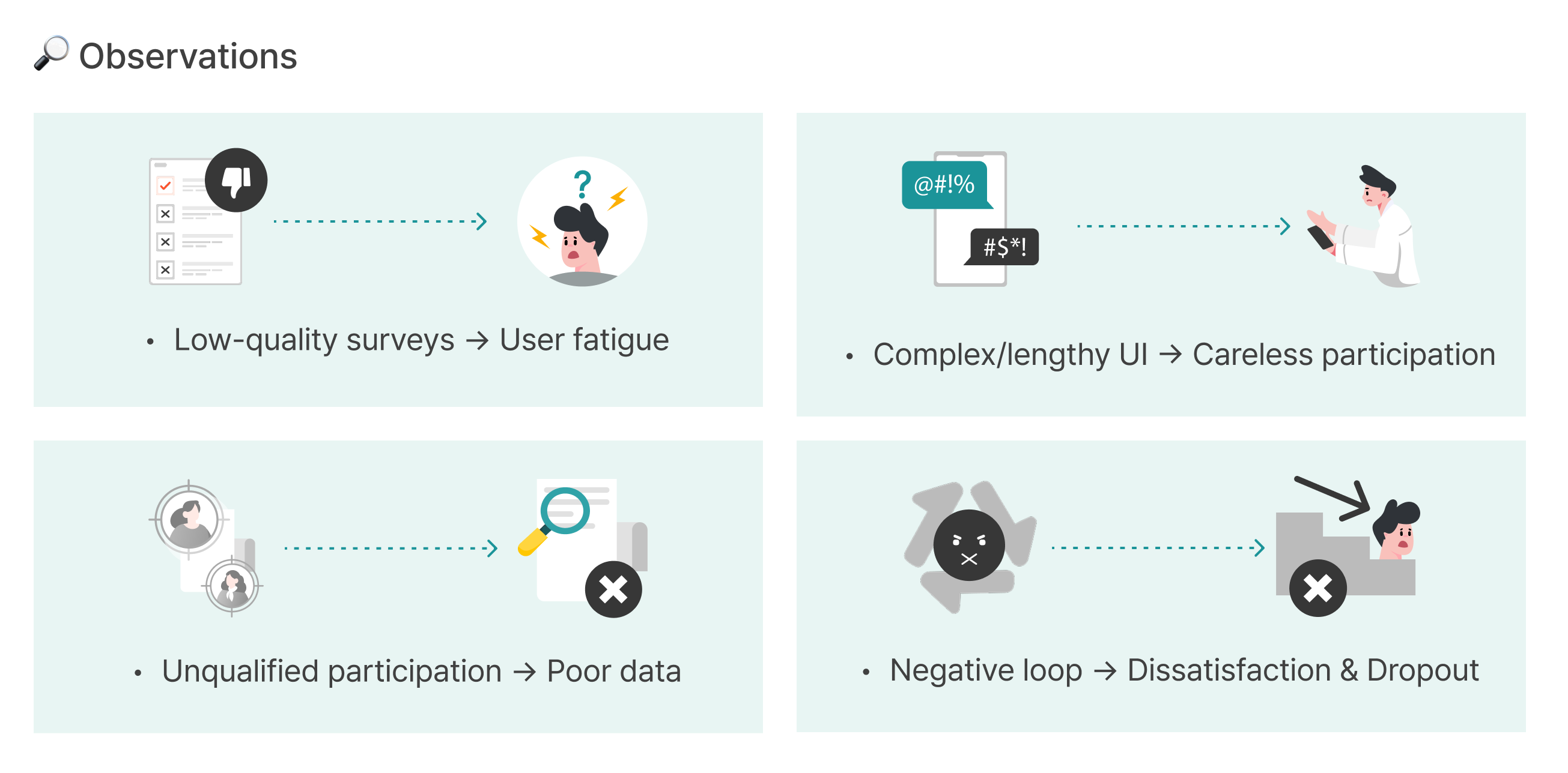
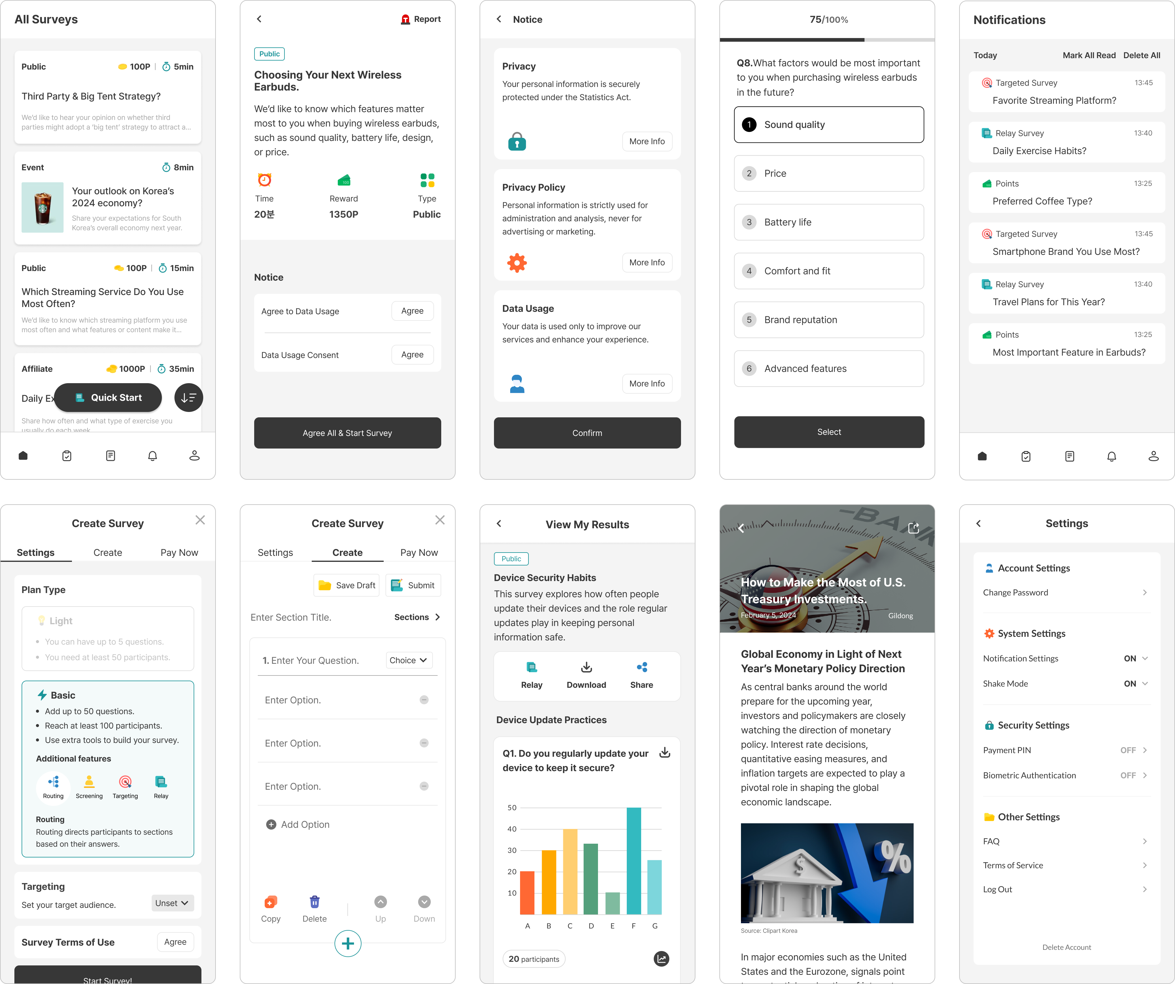
Most survey platforms in today’s market rely heavily on points or cash rewards to attract participants. While effective in recruiting, this approach often results in low quality engagement and raises questions about the reliability of survey outcomes.
As the sole product designer on the team, I contributed end-to-end across the product experience, designing the mobile and web platform, landing page, admin dashboard, and brand identity. My focus was on creating a cohesive and meaningful user experience that encourages genuine participation in surveys, while providing clients with trustworthy and actionable insights.

Problem Discovery Approach
To deeply understand user pain points in survey platforms, our team conducted a one-month competitor analysis. Each team member logged in daily to competing apps, actively participated in surveys, and systematically reviewed user feedback.
We documented positive features, potential improvements, and recurring patterns from both first-hand experience and app store reviews, which informed the following observations.
Research & Ideation
After identifying the problem, our team decided to individually explore potential solutions. To contribute meaningful ideas, I conducted competitor analysis, reviewed user feedback, and referenced academic papers on methods for obtaining high quality and reliable survey data. Based on these insights, I compiled a list of ideas that could address the core issues we uncovered. We then came together to share our solutions and brainstorm as a group. By voting on the most promising ideas, we collaboratively assessed which solutions best addressed the problem space. This process helped us align on a clear set of features to move forward with in the design phase.

Solutions
1. Making Surveys Engaging and Meaningful
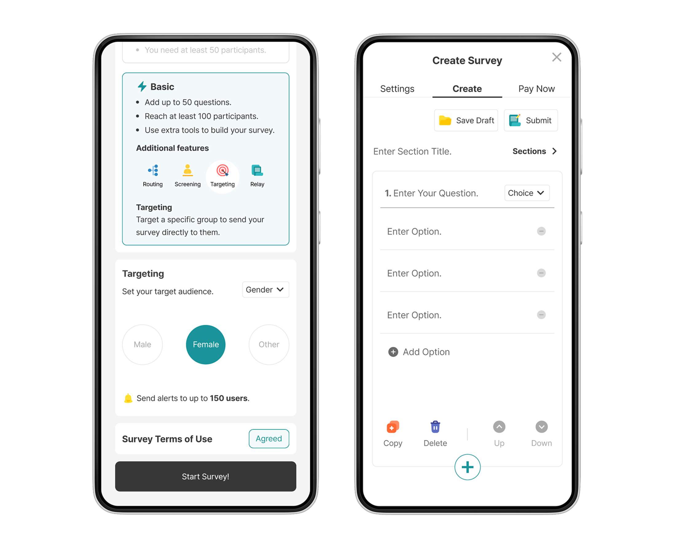
We explored why users often do not fully engage with surveys and found that long, complex questions made participation difficult. To address this, we designed an intuitive and easy-to-read survey form, and introduced a one-hand control mode to make scrolling more comfortable. In addition, we created a mobile survey creation form so that users could easily write and take surveys themselves. This approach was guided by Self-Determination Theory, which shows that users engage more sincerely when they feel a sense of control and can participate actively.

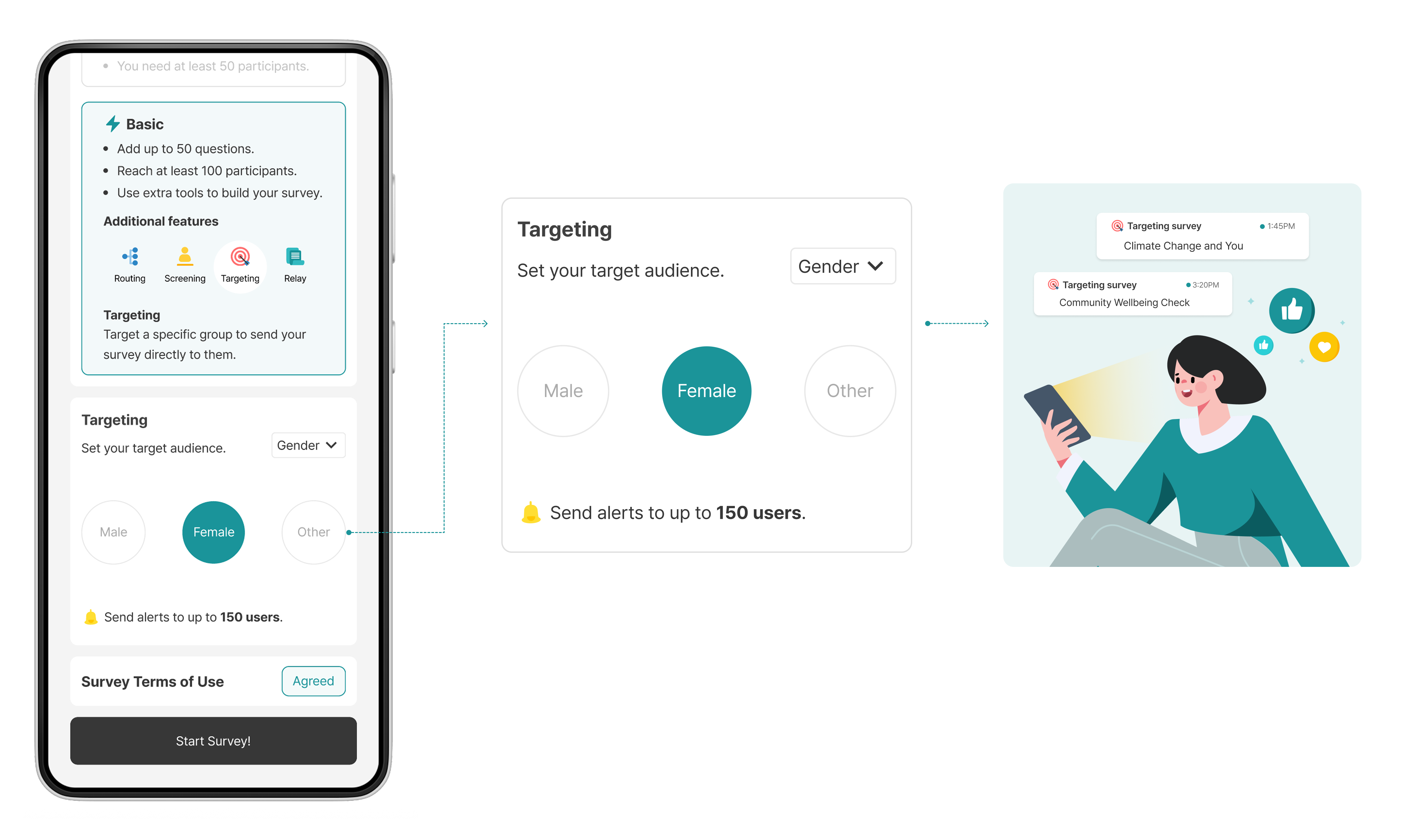
2. Targeting and Personalized Surveys
Our team spent a month actively participating in competitor surveys and discovered that surveys unrelated to users’ interests had lower click-through rates and struggled to drive genuine engagement. This aligns with Self-Relevance Theory, which suggests that users are more motivated to engage with information closely connected to their own goals and interests.
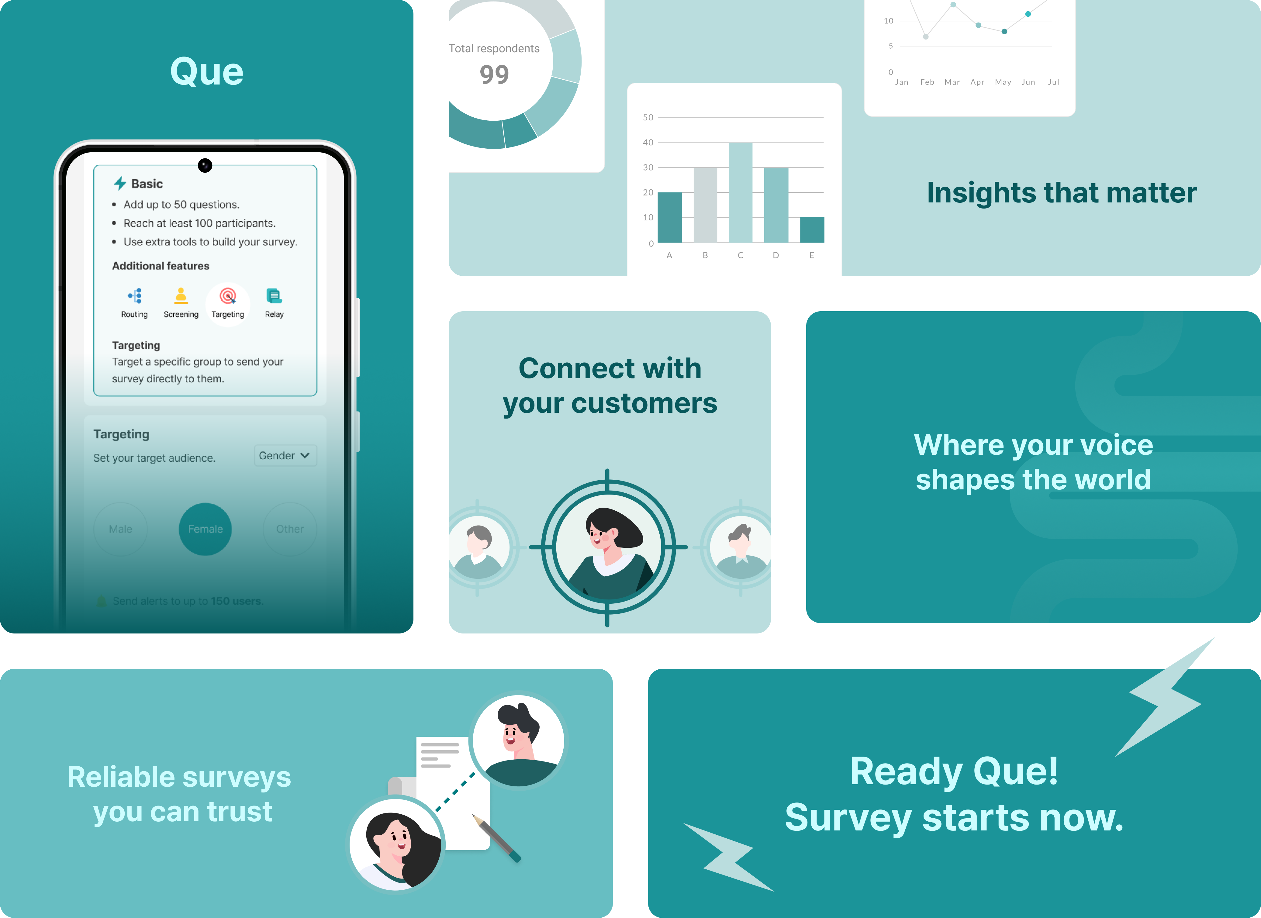
To address this, we introduced a targeting feature during survey creation, enabling personalized surveys tailored to each individual. This design approach helps foster more meaningful participation and improves overall engagement.In addition to the solutions described above, I also worked on various aspects related to reward policies and technical design. However, due to confidentiality, I am unable to disclose all the details. Instead, this highlights the design solutions I implemented to improve the survey creation and participation experience, helping users feel a greater sense of control and meaning throughout the process.
Information Architecture
After collecting and refining ideas from the previous brainstorming session, I organized an information architecture to map out where each solution should be implemented in the design process.

Wireframe & Product Requirement Document
I started by creating wireframes based on the Information Architecture. At each stage, I shared them with the team to gather feedback and iteratively refine the design. After aligning on the key decisions, I produced detailed documentation and handed it off to the developers, ensuring a smooth transition into the development phase.

App Design
After finalizing the service direction and concept, I moved on to high-fidelity design by applying brand colors and refining the visuals to align with the concept.
Brand Story
The service ‘Que’ carries two meanings.
First, it is an abbreviation for “Question”, and second, it symbolizes “Ready, Cue!”, representing being ready to start.
Que carefully selects meaningful surveys in a market flooded with indiscriminate questionnaires and delivers high-quality results. It attentively listens to user feedback, continuously improving the service while consistently aiming for top-notch outcomes.
What We Changed and Why?
#1. Complex main screen due to displaying multiple functions on one screen
-> Display only key functions
When multiple features are displayed to users simultaneously, it can create confusion regarding their desired actions. Therefore, by showcasing only the two main functions of "Ansimi," users can quickly access the services they need and achieve their goals efficiently.

#2. User-unfriendly address input box
-> Faster address settings
In the previous UI, users had to enter the full address each time, which was cumbersome. However, with the new UI, repetitive and tedious input time is reduced, allowing users to quickly find their destination through the new map feature.

#3. Unfriendly location sharing service
-> Quick location sharing confirmation
In the previous UI, receivers were often required to sign up each time they wanted to share their location, making the process difficult. This complexity could lead to discomfort and create barriers to service use. To improve this, we redesigned the service to allow quick and easy location sharing without sign-up. Our goal is to enhance the receiver experience and encourage registration with a smoother location sharing feature.

Overview
In South Korea, cryptocurrency referral programs often carry a negative image due to perceptions of market instability and concerns about potential fraud. In response, Catch-back aims to create a more user-friendly and trustworthy experience. To enhance accessibility, we redesigned the UI, introduced simplified referral methods, and added a pre-calculation tool that allows users to easily estimate potential rebates. These improvements are designed to increase ease of use and encourage longer engagement with our service.

Team Ideation
Our team engaged in an ideation process to enhance the Catch-back service, making it more competitive by offering optimized fees and introducing unique additional features. To ensure our fees were more reasonable, we conducted a thorough analysis of competitor discount rates and directly negotiated with companies to secure better terms.

Logo & Color
'Catch-back' carries the meaning of "getting back what was caught." To appeal to the primary target audience of the referral program, the MZ generation, we chose a purple color to convey a youthful and trendy vibe.


Design System

Main Features
1. Landing Page
Landing page include hero section, recommended exchange, footer. So when you land on the page for the first time, you'll see the hero section with the title and subtitle. As you scroll down, you'll come across the recommended exchanges, each linking to its respective detailed exchange page.

2. Withdrawal
The withdrawal page is displayed to users who have an existing account on the platform. Users can view the accumulated rebate amounts for each linked exchange, and once the amount exceeds a certain threshold, they can consolidate and withdraw the funds. The withdrawal amount is immediately visible on the main screen, and the intuitive and easy-to-use withdrawal system helps users quickly complete the process.

3. Payback Calculator
The Payback Calculator is a simulation tool that allows users to calculate how much of a fee rebate they can receive. By inputting three parameters—exchange, seed money, and leverage—users can quickly and easily perform a simulation. This service helps users compare and check fees with other platforms before creating an account, thereby encouraging more users to join the platform.
.png)
Main Features
1. Customized feeds and recommendations based on user preferences
Users can create groups with customized content displayed for each one, tailored to their specific characteristics. The main homepage showcases each group's traits and content that members can view together.

2. Interactive Group Content Experience
When watching content with group members in real-time, users can also participate in a group chat. This feature is a key highlight, as it allows users to share thoughts and ideas, going beyond just viewing the content.

3. Personalized Advertisements
Users can view and shop for advertised items while watching content. These ad items are personalized based on the user's preferences, which are gathered during the onboarding process when creating the service account.

Market Research
To differentiate the Gather service, we researched the main target audience, user perception, and growth potential in the OTT market.


Marketability

Amazon prime video X-ray
As X-ray background music can be streamed or purchased on Amazon, Amazon OTT is expected to expand into a media shopping mall where you can purchase desired products on TV. In addition, by investing in sports contents, it is expected that various products will be expanded to include travel contents such as sports, goods and overseas battery training.

YouTube Shopping Ads
YouTube Shopping Ads let creators tag products in videos, Shorts, and live streams, allowing viewers in select regions to browse and purchase directly on YouTube. Shoppable links appear in video descriptions, a product shelf, the Shopping button, or as pinned items during live streams, streamlining the shopping experience.
User interviews
One-on-one interviews and surveys were conducted to gather and analyze data on device usage and user experience. The survey included 20 questions and 13 participants. While the participants provided diverse responses, they could be broadly divided into two groups. Group A consisted of women in their 20s and 30s who enjoyed online shopping and frequently watched OTT content. Group B, which included both men and a smaller number of women with a similar age range, preferred engaging with social media for communication rather than online shopping. Based on these survey results, I developed personas and user flows, which are visualized in the next section.

Personas
Based on the insights derived from user interviews and surveys, virtual users were created to identify user personas and their experiences that may occur during app usage.


Competitor Analysis
To understand similar products on the OTT service, various applications have been compared. In addition, competitive studies on user reviews are analyzed for strengths and weaknesses.

Problem & Solution
Based on user interviews and market research, the problems identified can be categorized into three main areas. The solutions were derived from insights gathered through user interviews, specifically regarding users' ad preferences, as well as through competitor reviews and analysis.

Discoveries
Before designing the product, we conducted research on the demand for public safety services and users' perceptions.

Survey Findings
In a survey of 22 participants, the findings revealed that women in their 20s and 30s recognized late-night safety issues but were unaware of effective solutions, leading to feelings of disappointment. They primarily relied on calling family or friends for safety, finding no better alternatives than contacting 911 or someone they knew. Ultimately, they expressed hope for the development of improved mobile safety tools and services in the future.
.png)
Wireframe Sketches
With features set in mind, the skeleton of Ansimi is created. Sketching out what I’ve envisioned has helped me get a better sense of the app’s flow and what features should be added and removed throughout the users’ journey.


.png)